The Psychology of Logo Design: How Colors and Shapes Influence Customers
A half-bitten apple. That’s all it takes for your brain to say premium. That’s color psychology and logo design working silently — shaping perception before a single word is read. Logos aren’t art; they’re signals. They whisper what your brand stands for long before you get a chance to speak. A good logo doesn’t just look appealing — it feels right. And that feeling decides whether someone clicks, buys, or scrolls away. That’s the invisible science behind logo design psychology — turning design into emotion and emotion into action.
Your Brain Recognizes a Logo Before It Reads a Name
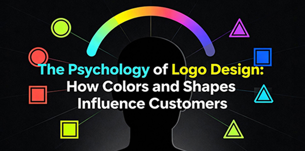
Here’s a truth most brands overlook: your audience doesn’t read your logo; they feel it. The human brain processes visuals 60,000 times faster than text — which means a logo has milliseconds to create trust, familiarity, or excitement. That’s where color psychology in branding and shape symbolism do their heavy lifting. Blue means calm, intelligence, and trust — why tech giants and banks love it.
Red triggers urgency, confidence, and power — think food, sports, and entertainment.
Green communicates balance, freshness, and safety — often used by health or sustainability brands.
Yellow gives optimism and warmth — the color of friendliness and youth.
Black and white represent timeless sophistication and simplicity — luxury’s favorite duo.
Even shapes talk. Circles create community and warmth. Squares mean stability and strength. Triangles? They mean progress, motion, and direction. That’s not creative opinion — that’s design psychology at work.
Logo Design Trends in 2025: Simplicity Wins, Always
In 2025, simplicity is the new sophistication. Modern audiences don’t want clutter — they want clarity. That’s why branding agencies in Bangalore and beyond are focusing on logos that feel adaptive and fluid — equally strong on a phone screen, billboard, or packaging label. The new rules of modern logo design: Flat, bold designs over detailed illustrations
Motion and gradient flexibility for digital-first branding
Responsive logos that scale for every platform
Accessible design with color contrast and readability
At thinkB, one of the best branding and logo design agencies in Bangalore, we’ve seen how a well-designed logo can reshape brand perception overnight. For one healthcare client, a subtle logo refresh — changing the palette, adjusting spacing, and modernizing typography — improved engagement and trust scores by 40%. Because sometimes, all it takes is smarter simplicity.
Color Isn’t Decoration — It’s a Strategy
Color is the silent persuader of design. According to studies, 85% of customers say color is the main reason they choose one product over another. In brand identity design, every hue tells a story: Black: premium, elegant, exclusive
Orange: creative, energetic, bold
Purple: imaginative, royal, ambitious
White: clean, transparent, modern
That’s why color psychology in branding isn’t about picking what “looks nice.” It’s about choosing what feels right for your market and message. When thinkB handles brand identity design or logo redesign services, color decisions aren’t made in isolation — they’re backed by strategy, behavior data, and user perception.
The Shape Spectrum: Curves, Edges, and Emotion
Shape defines personality. It’s why most fast-food chains use circles and curves — they subconsciously make people feel welcome. Meanwhile, tech and finance brands prefer sharper edges — projecting precision and control. In logo design psychology, circles often represent unity and trust, while triangles represent energy and ambition. Every curve, angle, or alignment choice affects emotion. That’s why the most iconic logos — Nike, Adidas, Pepsi — feel familiar before they’re even read.
Logo Redesign or Logo Refresh: Knowing the Difference
Not every brand needs a total makeover. Sometimes, evolution is better than revolution. A logo redesign redefines your entire identity — perfect when your business pivots or enters new markets. A logo refresh refines what already works — modernizing without losing legacy. At thinkB, we’ve helped brands find that balance. For one educational institution, we modernized a decades-old logo without erasing its roots — reworking the color palette, introducing scalable design elements, and creating a digital-friendly format. The result? A timeless mark that connects both alumni and Gen Z students. That’s what good branding design does — it evolves without disconnecting.
When to Redesign Your Logo
Your target audience or offerings have changed.
Your logo doesn’t scale well on digital platforms.
Your color palette feels outdated.
Competitors look newer and more confident.
Your team feels disconnected from your visual identity.
If any of this sounds familiar — it’s time to call your branding agency in Bangalore. Or, better yet, thinkB — your friendly neighborhood creative agency near you that knows the science behind visual storytelling.
Final Thoughts
Your logo doesn’t speak — it whispers. It doesn’t shout “buy me,” it silently says “trust me.” That’s the magic of logo design psychology — when done right, it doesn’t just look beautiful, it feels inevitable. At thinkB, we’ve mastered the blend of creativity and psychology — designing logos that look good, feel right, and stay memorable. Because colors fade and trends evolve — but perception lasts forever. So, what does your logo say when you’re not around to explain it?